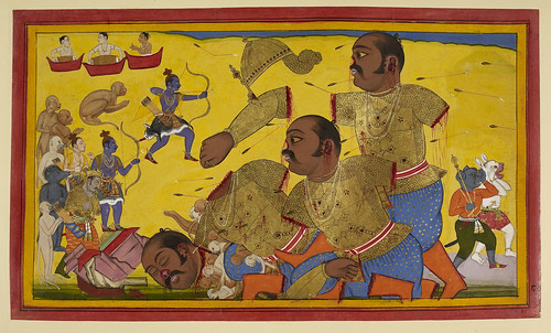
Ich habe in letzter Zeit zwei Spiele gespielt, die auf visueller Ebene genau mein Spektrum von dem repräsentieren, was ich für gutes und schlechtes Design von Fantasy-Spielen halte.
Fangen wir mit dem Guten an: Demon’s Souls. Das Spiel ist unendlich düster, gäbe es nicht einen leuchtenden Stein als Lichtspender dabei, wäre es häufig völlig dunkel. Und dieser Lichtradius ist sehr beschränkt (was herrlich an Diablo erinnert), wie oft beschrieben, kündigen sich Feinde meist durch Geräusche an bevor sie Sichtbar sind. Das Spiel mit Licht und Schatten, macht nicht nur einige nicht wirklich hochauflösende Texturen wieder wett, es trägt auch viel zur bedrückenden, düsteren Stimmung des Spiels insgesamt bei.
Desweiteren ist Demon’s Souls eines der (wenigen) Spiele, das größtenteils auf Waffen gigantischen Ausmasses und vor Muskeln fast explodierenden Charakteren verzichtet (negativ-Beispiele gibt es hier viele, ich nenne hier mal nur God- und Gears of War und leider auch Dantes Inferno). Ich kann solche wandelnden Fleischbrocken nicht ernstnehmen, vor allem, wenn ich sie spielen soll, solche Games sind insofern für mich nichts. Das Einzige, was mir hier bisher in dieser Hinsicht bei Demon’s Souls negativ aufgefallen ist, sind die riesigen Raben (der Sinn erschließt sich mir hier nicht, im Gegensatz z. B. zu den Ratten aus Oblivion sind die Raben keine Feinde, müssen deswegen eigentlich nicht extra vergrößert werden, damit sie gut zu sehen sind). Ich bin mir nicht ganz sicher, ob dieser Realismus das Spiel psychologisch noch schwerer macht, als es ohnehin schon ist, ich habe es erst mit meinem dritten Character, einem – im Gegensatz zu meiner Jägerin und meiner Magierin – gut gerüsteten Templer geschafft, das erste Level (1-1 …) durchzuspielen.* Daß die gespielte Figur kein muskelbepackter Typ ist, der einfach in eine Horde von Viechern springt und alles niedermacht, sollte einem nach den ersten Spielminuten klar sein und das zeigt einem das Character-Design sehr gut.
Auch alles andere ist stimmungsvoll inziniert, von den diversen Dämonen über die In-Game-Elemente (die „Leichen mit Schatz“-Markierung, die Zielerfassung, etc.) bis hin zu den Menüs, die sehr – fast zu – schlicht und technisch gehalten sind, sich aber immerhin nicht in missglückten gemaltem Pergament-Imitationen verlieren (siehe Oblivion).
Dragon Age: Origins ist das genaue Gegenteil, die Grafik und Character-Animation ist nicht nur grottig, es gibt auch absolut keine Schattenspiele, alles ist gleichmässig langweilig ausgeleuchtet. Weibliche Charaktere haben ausnahmslos riesige Brüste, die männlichen tragen Rüstungen, die ich einfach nicht ernstnehmen kann (mal abgesehen von aufs Dreifache skalierten Schulterpanzern verstehe ich nicht, was solche unendlich großen Schnallen da machen, haben die Macher Angst, daß die sonst nicht erkannbar sind? Ist das einfach nur peinlich oder was?). Auch generell herrscht hier wieder dieses Größenverhältnis-Problem vor, was mir meine bisherigen Ausflüge in die Welt der MMORPGs schnell verleidet hat: Die Charaktere wirken wie Zwerge** in einer (schlecht texturieren) Umgebung. Ich bin immer noch nicht dahintergekommen was dieses Missverhaltnis für einen Sinn hat (können Häuser etc. sonst aus der Ferne nicht erkannt werden?).
Gibt es irgendwas, das ich nicht doof fand, an diesem Spiel? Die Geschichte vielleicht, öfters mal vor eine moralische Zwickmühle gestellt zu werden, war recht erfrischend. Aber alles andere war echt zum abgewöhnen, Orks kann ich irgendwie als Gegner überhaupt mehr nicht ernst nehmen (Skelette und Zombies, okay, aber Orks? C’mon, das macht ein Spiel für mich immer zu einer schlechten Kopie von Mittelerde) und ich verstehe nicht, warum die Charaktere „Das sollte kein Problem sein“ sagen, wenn ich sie einen Zauber wirken lasse. Das versetzt mich in so eine komische „unsichtbarer Anführer“/Gott-Position, die für das Hineinversetzen in die Charaktere nicht gerade förderlich ist.
Inhaltlich sind die Spiele kaum zu vergleichen, ich bin aber eigentlich ganz froh über Demon’s Souls, das zur Abwechslung mal kaum Handlung hat und sich auf klassisches Dungeon-crawling/Hack ‘n’ slay verlässt. Action-RPG heißt das heutzutage anscheinend. Schön, mir steht grade nicht so der Sinn nach beschaffe Item X, rede mit Person Y und morde Person Z.
Okay, hier nochmal Trailer für Dragon Age: Origins*** und Demon’s Souls. Im Grunde eine gute Zusammenfassung beider Spiele und warum ich das eine gut und das andere schrecklich finde (Dragon Age war so ein Verlegenheits-Ding, weil Red Dead Redemption in der Videothek ausgeliehen war).
* Kann natürlich auch sein, daß ich erst beim Templer begriffen hab, wie das Spiel so funktioniert (nämlich jeden Feind als Gegner sehen, Angriffsmuster studieren, eine Taktik entwickeln und zuschlagen).
** Über diese hahnebüchend unrealistischen Blutspritzer-Effekte lasse ich mich jetzt einfach mal nicht aus.
*** Oder: wer wissen will, wie scheiße Dragon Age wirklich ist, schaue sich bitte dieses Video an (und hier nochmal worum’s bei Demon’s Souls geht).